Building Activity Rings with SVG
What We’re Building
Activity rings are a visualization made famous by the Apple Watch, which encourages you to “close your rings” every day by completing various activities.
Before we get started though, I should mention that these rings only work in certain situations when displaying certain data sets. While they are great for showing a percentage and looking good while doing it, they are a bad idea if you want your users to compare the rings to each other. The outer rings will be longer than the inner rings even when they are representing the same amount. When used judiciously though, these rings are great for showing data in an engaging, interesting, and aesthetically pleasing way.
If you’d like to jump straight into the finished code, check it out on codepen here.
Also, I’ve put a ton of reference material in the References and Further Reading section below. If you’re unfamiliar with SVG, CSS, or any of the technologies used in this tutorial, check them out to get up to speed.
Magic Radius Calculation
The key to making these easy to use is making the circumference of the circle
equal to 100. If we do that, then we’ll be able to show percentages
without having to do any scaling when we render.
The circumference of a circle C equals two, multiplied by pi, multiplied
the radius of the circle.
C = 2πr
Working backwards, that gives us
100 = 2πr so that r = 100 / 2π
Which means that our magic number
for the radius of a circle with a circumference equal to 100 is
r = 15.915
Drawing a Circle
Ok, let’s put it all together and draw a circle.
Markup
<svg class="ActivityRings" viewBox="0 0 35 35">
    <g class="ring ring1">
        <circle class="background"
            cx="50%" cy="50%"
            stroke-width="3"
            r="15.915" />
    </g>
</svg>
Styles (scss)
.ActivityRings {
    height: 100%;
    width: 100%;

    circle {
        fill: none;
    }
}

$color-red: #c53f3d;
.ring1 {
    .background {
        stroke: transparentize($color-red, 0.8);
    }
}
The cx="50%" cy="50%" renders the ring in the middle of our ViewBox,
and by adding class names, we can
style them like we would HTML components, though SVG elements have a few new
attributes to work with such as fill and stroke.
Ok, you should now see something like

That’s not bad, but not very interesting either. Let’s add a ring representing 85% completion for this activity. First, we’ll add another circle after our background circle. SVG renders in source order, so the items first in the markup are rendered behind the items later in the source.
Markup
<svg class="ActivityRings" viewBox="0 0 35 35">
    <g class="ring ring1" style="transform: scale(1) rotate(-90deg);">
        <circle class="background"
            cx="50%" cy="50%"
            stroke-width="3"
            r="15.915" />
        <circle class="completed"
            cx="50%" cy="50%"
            stroke-width="3"
            r="15.915"
            stroke-dasharray="85, 100" />
    </g>
</svg>
Styles (scss)
@keyframes RingProgress {
    0% {
        stroke-dasharray: 0 100;
    }
}

.ActivityRings {
    height: 100%;
    width: 100%;

    .ring {
        transform-origin: 50%;
    }
    .completed {
        animation: RingProgress 1s ease-in-out forwards;
        stroke-linecap: round;
    }
    circle {
        fill: none;
    }
}

$color-red: #c53f3d;
.ring1 {
    .background {
        stroke: transparentize($color-red, 0.8);
    }
    .completed {
        stroke: $color-red;
    }
}
Stroke Dash Array
The stroke-dasharray style attribute will allow us to control how much of
the circle to draw. This property allows developers to have a large amount
of control over how dashed lines are rendered in SVG.
We’ll be using it to draw the “filled” part of our circle.
stroke-dasharray="85 100"
The first number tells the browser how much to draw. In our case, since the circumference of the entire circle is 100, we can set this equal to the percentage and it will draw a line for the right amount! The second number is how long to make the gap in-between the dashes. We can just set this to 100 so that no matter what percentage we’re displaying, we’ll just get one line.
We can animate the drawing of the ring by setting the starting the animation
at stroke-dasharray="0 100" and playing forwards to
stroke-dasharray="85 100" Now your ring should look like:

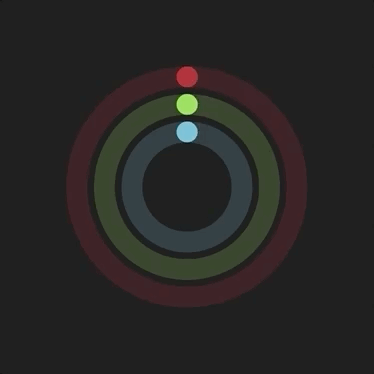
Adding Rings
Adding rings is a simple matter of copying and scaling the ring. To keep the
stroke widths the same through the scaling, divide the starting stroke-width
of 3 by the scaling factor. So for ring 2:
stroke-width = 3 / 0.75 = 4
and for ring 3:
stroke-width = 3 / 0.50 = 6
Markup
<g class="ring ring1" style="transform: scale(1) rotate(-90deg);">
    <circle class="background"
        cx="50%" cy="50%"
        r="15.915"
        stroke-width="3" />
    <circle class="completed"
        cx="50%" cy="50%"
        r="15.915"
        stroke-width="3"
        stroke-dasharray="85, 100" />
</g>

<g class="ring ring2" style="transform: scale(0.75) rotate(-90deg);">
    <circle class="background"
            cx="50%" cy="50%"
            r="15.915"
            stroke-width="4" />
        <circle class="completed"
            cx="50%" cy="50%"
            r="15.915"
            stroke-width="4"
            stroke-dasharray="85, 100" />
</g>

<g class="ring ring3" style="transform: scale(0.5) rotate(-90deg);">
    <circle class="background"
            cx="50%" cy="50%"
            r="15.915"
            stroke-width="6" />
        <circle class="completed"
            cx="50%" cy="50%"
            r="15.915"
            stroke-width="6"
            stroke-dasharray="85, 100" />
</g>
Styles (scss)
$color-red: #c53f3d;
.ring1 {
    .background {
        stroke: transparentize($color-red, 0.8);
    }
    .completed {
        stroke: $color-red;
    }
}

$color-green: #94d55a;
.ring2 {
    .background {
        stroke: transparentize($color-green, 0.8);
    }
    .completed {
        stroke: $color-green;
    }
}

$color-blue: #70bed7;
.ring3 {
    .background {
        stroke: transparentize($color-blue, 0.8);
    }
    .completed {
        stroke: $color-blue;
    }
}
For the complete code, check it out on codepen
References and further reading
- https://developer.mozilla.org/en-US/docs/Web/SVG
- https://css-tricks.com/using-svg/
- https://abookapart.com/products/practical-svg
- https://www.sarasoueidan.com/blog/svg-coordinate-systems
- https://developer.mozilla.org/en-US/docs/Web/SVG/Attribute/viewBox
- https://developer.mozilla.org/en-US/docs/Web/SVG/Attribute/stroke-dasharray
- https://css-tricks.com/almanac/properties/s/stroke-dasharray/
- SVG Essentials
- http://svgpocketguide.com